
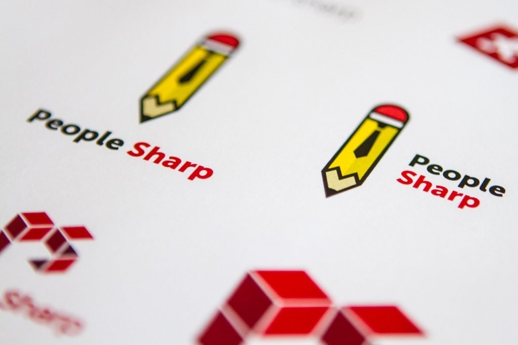
Another successful branding project is complete and we wanted to share with you! PeopleSharp is a job recruitment agency that came to us looking for a strong and simple logo. Right away, a few interesting ideas came to mind. Bert wanted the logo to be professional but yet friendly. Based on that, and some other guidelines that he provided, we decided that the imagery would be best as an icon with a colour palette of grey and reds.

Early logo concepts
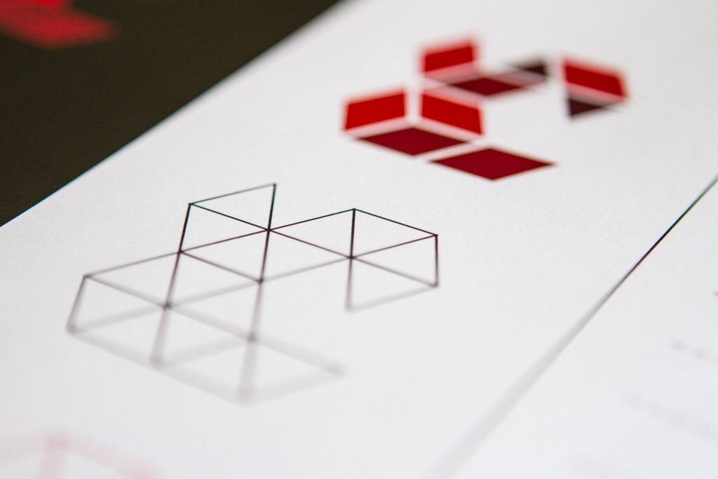
During the creative process, we thought of geometric shapes, and felt that creating the P and S from a series of squares could be interesting if executed well. After working with the wire frame to get the perspective correct, the next step was colouring.
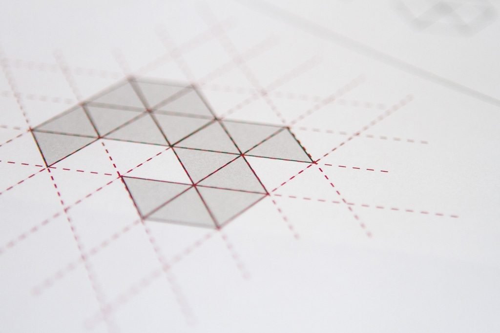

Approaching the final design
Keeping the colour palette in mind, we wanted to make the shape appear 3D by using certain tones in each space of the grid. The final design really hit the mark and we’re all very happy with it. This will be a fun logo to work with when designing future collaterals and we look forward to working with PeopleSharp as they continue to promote their brand!
Mario Fernandes, Graphic Designer